Building Visual Personality for National Champion Football Team
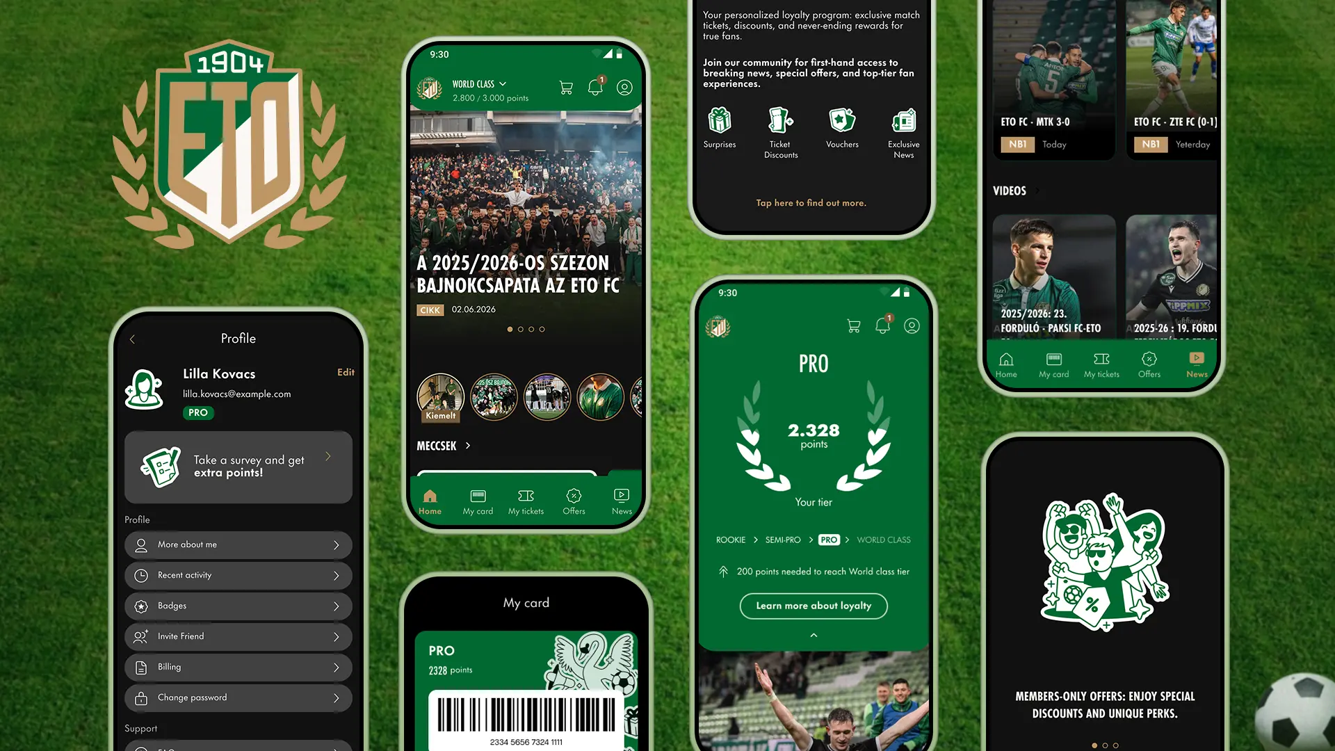
The 2026 Hungarian football champion team needed an app that would unite all their media, merchandise, and boost season ticket sales. Built on an existing framework, but it had to win over the fanbase, stand apart from every other club, and reward real supporters with insider content and references to club
Client
ETO FC
Project year
2026
Project type
Interface Design
Brand Design
Media Design
I worked as a senior UX/UI designer in a three-person design team responsible for the app's visual designs, collaborating closely with the club's representatives, a two-person delegation in daily communication that often expanded to include logistics, technical, and merchandising leads when we presented finished feature designs. The client placed strong emphasis on standing apart from other clubs, which was challenging, because no unique visual language or symbol system existed beyond the team colors, green, white, and gold, and the recently modernized crest.
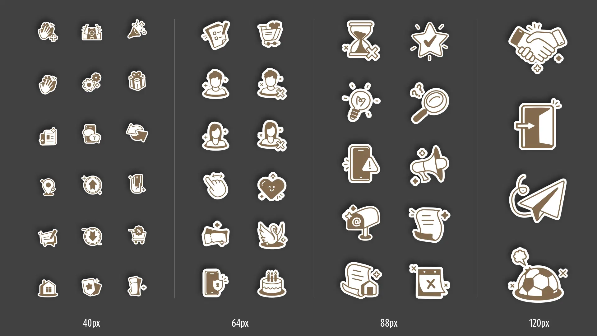
We spent months defining rules for color usage, typography, shapes, spacing, and animation style because nothing existed to inherit. We reverse engineered a system from the crest, then layered the website text style and the stadium icon language with modern, hand drawn illustrations combining dozens of client provided samples. Screens and prototypes were built in Figma by the three of us, but all imagery was my responsibility.
This process was iterative by necessity. I produced multiple icon sets and illustration sets as visual proposals, circulated them internally at ETO, and folded the feedback into the next version.
Once we locked the style, the real work began: over 100 unique icons, illustrations, and animations, each carrying a distinct personality for the app.
The timeline was fixed by the football calendar. Season tickets had to be purchasable before the 2026-27 opener, and the app shipped on time for iOS and Android. Art direction in a white label ecosystem is a tension play. Build inside someone else's architecture without letting the user see the seams. If a supporter opens the app and thinks about the team, not the platform, we did the job.
Featured Projects
See More of My Work
Take a look at these projects and reach out to start your next one!